This mani is not an original design. I saw it on Illamasqua's website last year and have been wanting to copy it ever since but never had the time or the resources. Today I had both.
I started out with Color Club Pretty in Platinum. This is a bone colored creme with just a little bit of shimmer. It covers like a dream and is completely opaque in 2 coats.
Then I added a half moon mani over the top of Zoya Carrie Ann. This is one of my all time favorite reds Its a gorgeous red sparkle.
Then I added the funky french tips using the Color Club again.
ShareThis
Tuesday, April 5, 2011
Monday, April 4, 2011
Zoya - Sooki
Hello! Here is my other polish that I received from Zoya's latest BOGO promotion. It's Sooki, a BRIGHT red jelly polish that looks AWESOME. So sexy. I never used to be into reds but I loooove this one. And the namesake obviously coming from True Blood? Awesome... it's definitely a blood-y colored red. I used two coats here.
Sorry for the quick post, but I have lots to do for school! This graduation thing is stressful :P
Sunday, April 3, 2011
Jesse's Girl Firefly
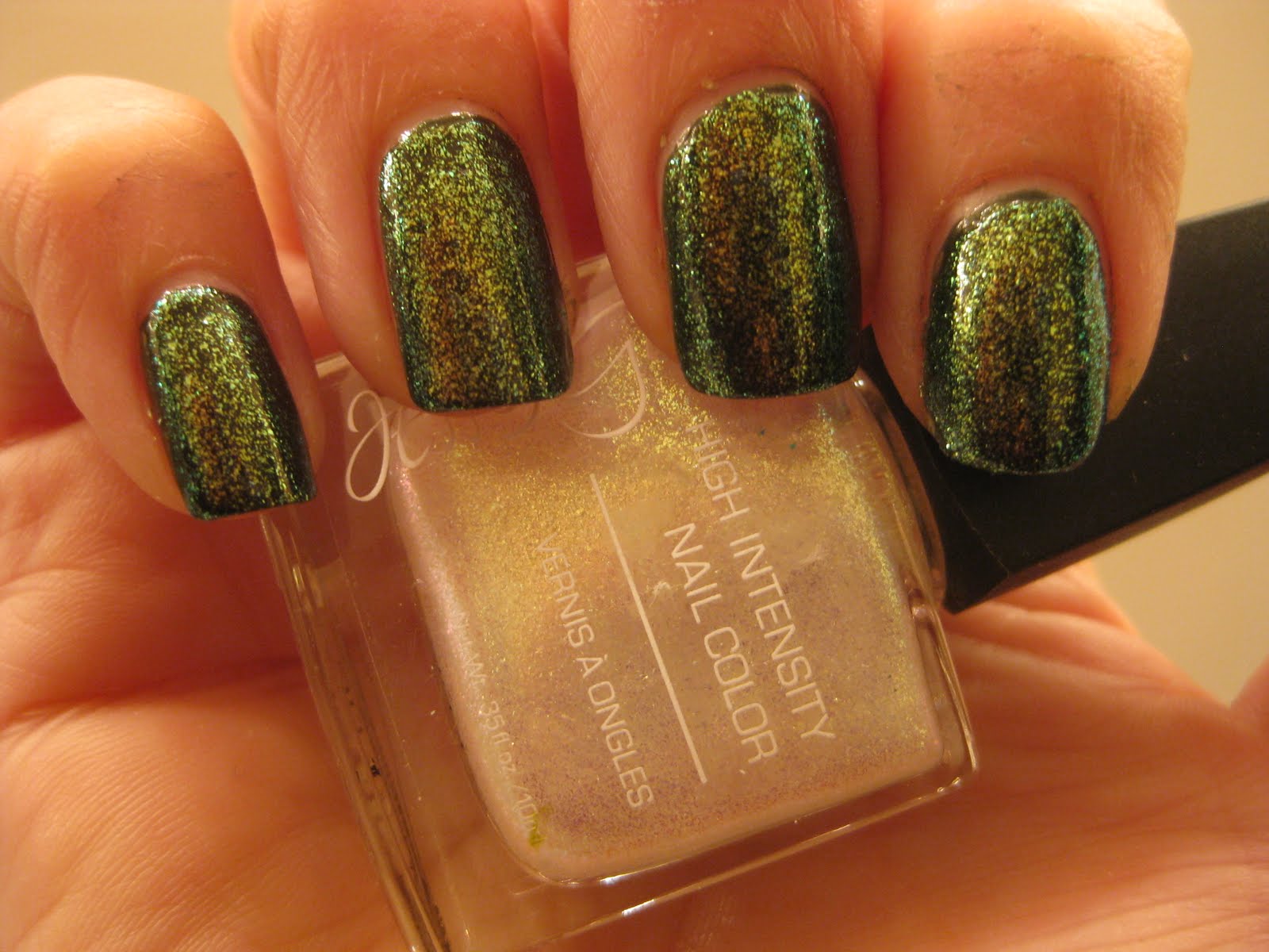
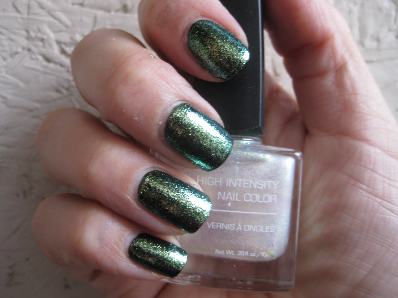
I've been wanting to try this polish ever since I got back from vacation. I liked Confetti so much I was anxious to see what this looked like on my nails. In the bottle it looks like a white glitter in a clear base. Kind of like an iridescent snow globe.
I started with OPI Here Today Aragon Tomorrow. Had some issues with this polish - very uncharacteristic of OPI. It didn't seem to want to cover smoothly and I ended up needing 3 coats to make it opaque. For those that aren't already familiar with this polish, it's a very dark forest green that looks almost black on the nail. You can see the green a bit in the bottle on the third pic.
Over the top I applied Firefly. It flashes a green and gold duochrome. It actually reminded me a little of Zoya Ivanka but a little more sparkly.
I started with OPI Here Today Aragon Tomorrow. Had some issues with this polish - very uncharacteristic of OPI. It didn't seem to want to cover smoothly and I ended up needing 3 coats to make it opaque. For those that aren't already familiar with this polish, it's a very dark forest green that looks almost black on the nail. You can see the green a bit in the bottle on the third pic.
Over the top I applied Firefly. It flashes a green and gold duochrome. It actually reminded me a little of Zoya Ivanka but a little more sparkly.
Saturday, April 2, 2011
Studio M Slammin' Red and Purple Medallion
Amanda is still really sick so I'm going to go ahead and post on her usual posting day. Everyone send 'get well soon' vibes to Amanda!
I'm a big fan of Color Club and Studio M polishes and have been admiring these two in the bottle for a while now. I decided to post them together because they are very similar.
Slammin' Red is a raspberry colored polish with holographic glitter particles. It isn't really what I would consider 'red'. Purple medallion is a dark magenta colored polish with holographic glitter. It isn't what I would consider 'purple'. The bottle color stays pretty true on the nails - what you see is what you get.
The glitter is very dense and suspended in a jelly-type base so the formula is very thick. If you've ever used the Milani Rockstar Heavy Glitter polishes its almost identical to the consistency of those but the Studio M polishes boast a little more shine and don't absorb light quite as much as the Milani - thus they are more glitter-y.
They covered in one coat but I did a second just to even out the thin spots. Application is a little gloopy, patience is the key to good coverage. Dry time is a little slower than average but that's to be expected considering the saturation of the glitter.
Here is Slammin' Red
And here is Purple Medallion
And here they are side by side.
I'm a red lover so I expected to like the red one the most. Surprisingly, I actually slightly prefer the purple. The darker base shows off the holographic glitter a little better. What do you think?
I'm a big fan of Color Club and Studio M polishes and have been admiring these two in the bottle for a while now. I decided to post them together because they are very similar.
Slammin' Red is a raspberry colored polish with holographic glitter particles. It isn't really what I would consider 'red'. Purple medallion is a dark magenta colored polish with holographic glitter. It isn't what I would consider 'purple'. The bottle color stays pretty true on the nails - what you see is what you get.
The glitter is very dense and suspended in a jelly-type base so the formula is very thick. If you've ever used the Milani Rockstar Heavy Glitter polishes its almost identical to the consistency of those but the Studio M polishes boast a little more shine and don't absorb light quite as much as the Milani - thus they are more glitter-y.
They covered in one coat but I did a second just to even out the thin spots. Application is a little gloopy, patience is the key to good coverage. Dry time is a little slower than average but that's to be expected considering the saturation of the glitter.
Here is Slammin' Red
And here is Purple Medallion
And here they are side by side.
I'm a red lover so I expected to like the red one the most. Surprisingly, I actually slightly prefer the purple. The darker base shows off the holographic glitter a little better. What do you think?
Friday, April 1, 2011
Orly Spark and dreaming of daffodils
I've been seeing daffodils popping up everywhere the last week or so and I wanted to do a manicure that was inspired by the flash of color from these harbingers of spring. I started out with Orly Spark, which is a nice medium yellow creme. I had some issues with brush strokes and needed 3 coats to get it to look smooth.
My intention at this point was to stamp some konad flowers over it with a nice opaque orange. I chose Zoya Tangy because its a creme that covers well. Unfortunately it didn't lend itself well to stamping and the effect was more subtle than I wanted. Learning experience, right? I still stink at getting my design centered.
So, happy Spring everyone!
My intention at this point was to stamp some konad flowers over it with a nice opaque orange. I chose Zoya Tangy because its a creme that covers well. Unfortunately it didn't lend itself well to stamping and the effect was more subtle than I wanted. Learning experience, right? I still stink at getting my design centered.
So, happy Spring everyone!
Subscribe to:
Posts (Atom)